Each is a full, scrollable homepage built on the real Action 1st brand — the authentic red & black, your logo, and photos of actual OC installs. They share content and structure but explore three distinct design philosophies. Open any one, scroll the whole page, then tell me which elements to combine.
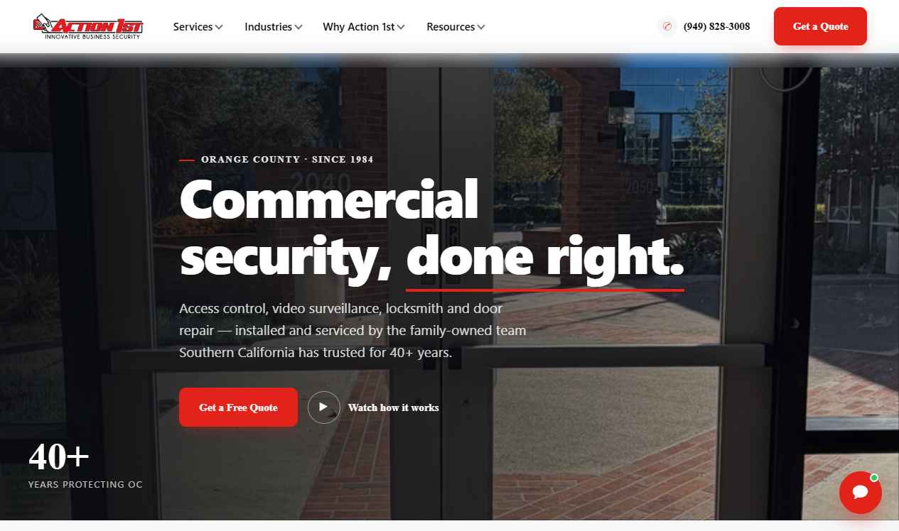
Clean, spacious, restrained. White space, near-black headlines, a tabbed "Why Us" explainer and a photographic industries grid. Feels modern and trustworthy.
Open homepage →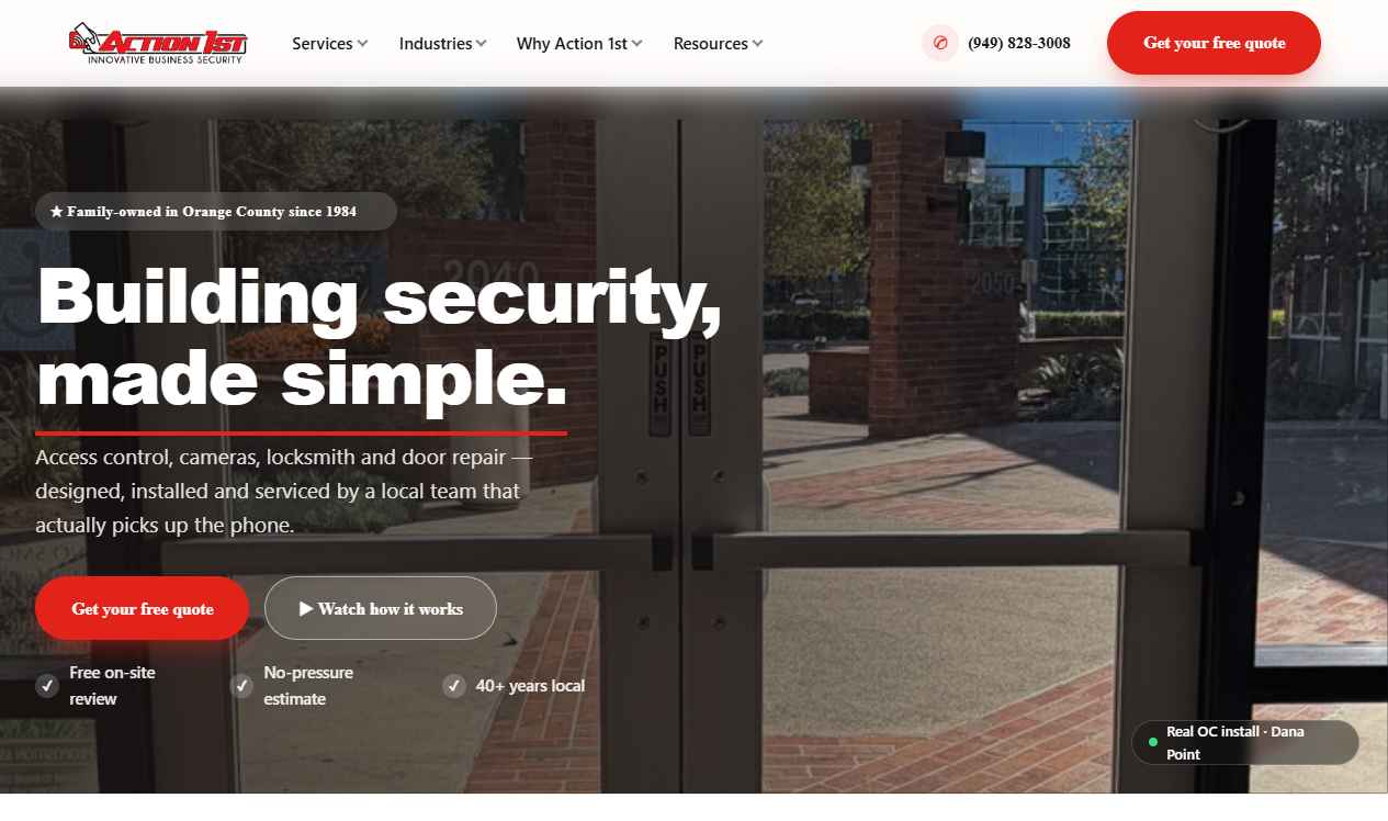
Rounded cards, soft shadows, warm off-white. Split video hero, trust counters, audience segmentation and rich testimonials. Friendly and conversion-focused.
Open homepage →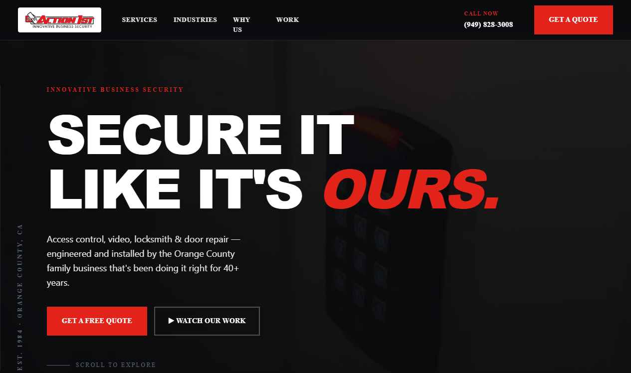
Dark canvas, oversized type, italic red accents echoing the logo. Numbered sections, editorial service list and a mosaic install gallery. The most distinctive direction.
Open homepage →